At the end of January we launched a new website redesign for a client. Since the launch leads captured have nearly doubled while traffic only increased a small amount. How important is the design of your site? Based on the numbers in this case study, extremely important. If you’re not generating the amount of leads you want the problem may not be with your marketing initiatives, it may reside with your website.
The Numbers
Leads Generated
- Leads generated in the 12 months prior to the new website redesign: 198 (16.6 per month)
- Leads generated in the 5 months prior to the website redesign: 83 (16.6 per month)
- Leads generated in the five months since website redesign launched: 153 (30.6 per month)
That is a 91% increase in leads.
Website Traffic
- Average website traffic prior to the new website redesign: 1,200 per month
- Average website traffic since the website redesign: 1,400 per month
That is a 16.6% increase in traffic
Conversion Increase (Leads/Traffic)
- Conversion Percentage prior to the new website redesign: 1.4%
- Conversion percentage since the website redesign: 2.2%
That is a 57% increase in lead conversion
**Since the website launch there has been no changes in the marketing of the website.
Conclusion
While some of the new leads can be attributed to the new traffic, the majority of new leads is driven by the increase in the conversion rate.
4 Website Changes Driving The Increase In Leads
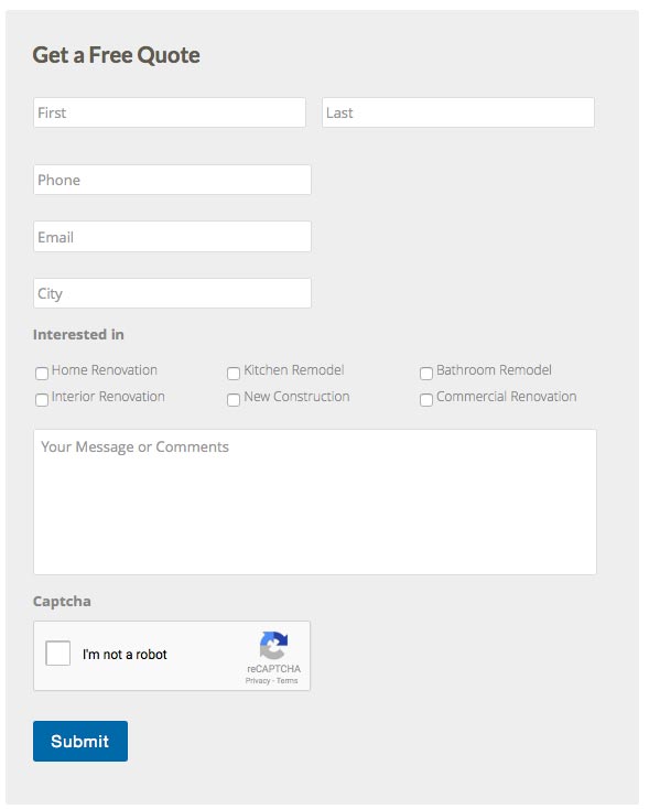
1. One of the biggest changes we made was to add a visible Quote Request form at the bottom of the content on each page.
Prior to the redesign we included a text based call-to-action on each page with a form in an accordion.

The new design removed the text portion of the CTA and brought the form out of the accordion.
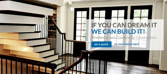
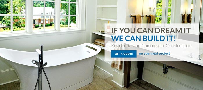
2. We changed the multi-messaged slider to a single message to support our primary call-to-action – Get A Quote. Studies have shown that fewer than 1% of people click on the slides after the initial slide. By keeping the message consistent we place more emphasis on the primary objective (if someone could only do one thing on the page, we want them to submit a Quote Request), while still being able to show different images representing the full scope of work the client does.
The previous slider included images tied to learning more about Glazer Construction, the residential services, commercial services and the project portfolio.


The new slider kept a single message across multiple slides showing images of the different types of projects they handle.




3. Improved the Visual Navigational Menu for the projects, videos and virtual tours.
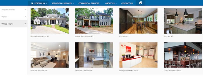
On the old site we had already implemented a mega menu to show portfolio items in a more visual manner. In the redesign we simply focussed on improving the design and layout to better showcase the projects. The original had three images, one each for photos, videos and virtual tours. With the new design we used tabs for each which allowed us to add more photos of each category.
Here is the original portfolio mega menu layout.

The new mega menu using tabs does a better job of visually representing the portfolio which is a key component in building credibility with prospects.


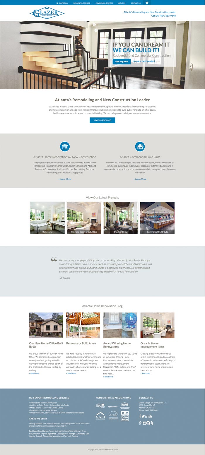
4. We increased white space on the page to allow the eye to better peruse the content on the page, along with some tweaks to the content and how the content laid out.

The new site with increased white space and tweaked copy.
Wrap Up
Website design and best practices are constantly evolving as new technology and techniques are developed. You job as an online marketer is to ensure that your website keeps up with not only the latest design and technique trends, but that also adjusts to how consumer research and purchase behavior changes. On average you need to consider a redesign or refresh every 24 to 36 months.
One thing to keep in mind is that as your site build SEO value through search engines you have to be careful when you make changes. The worst mistake you can make is to wipe out years of SEO value by complete changing the design and content of your site. One of the ways we combat the loss of SEO value is to improve the site visually while maintaining consistency in the content.
For the client above, while we did a significant design upgrade, we kept the majority of the content on the site consistent, only making changes where we felt we could improve the SEO performance. Another consideration is if you are eliminating a page from your site, it may make sense to keep the page but simply remove it from the navigation. Or at least use a 301 redirect to send traffic to the deleted page to the most relevant current page.


